Home / Lorelvis | UX UI & Motion Designer / Xhinola Landing page
Xhinola Landing page
Description
About the project
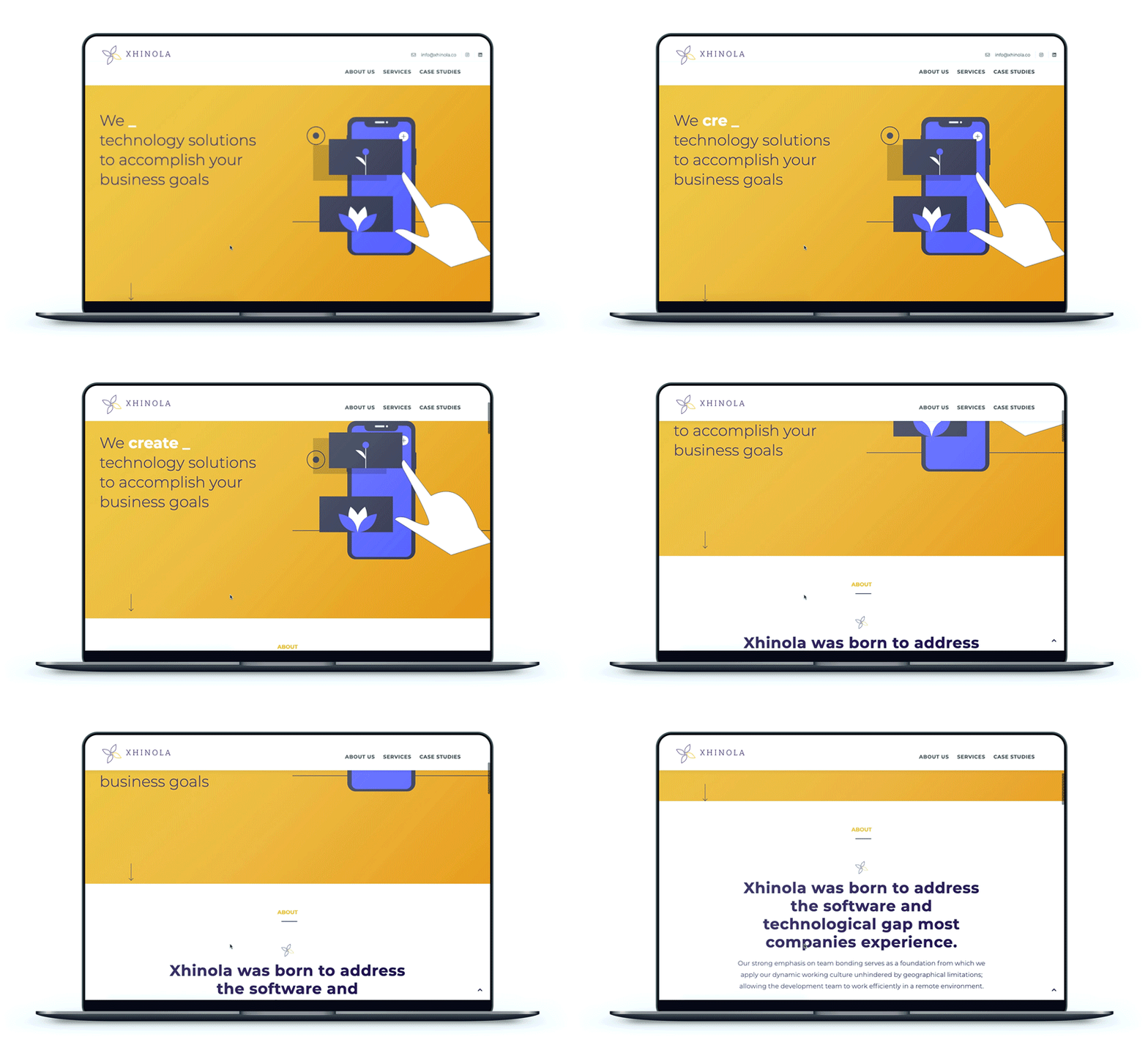
Xhinola was born to address the software and technological gap most companies experience.
Our strong emphasis on team bonding serves as a foundation from which we apply our dynamic working culture unhindered by geographical limitations; allowing the development team to work efficiently in a remote environment.
We are a team of professionals in areas like UX Design, Software Development and Agile Methodologies.
Approach
"Create a new look and feel, fresh, innovative with energy"
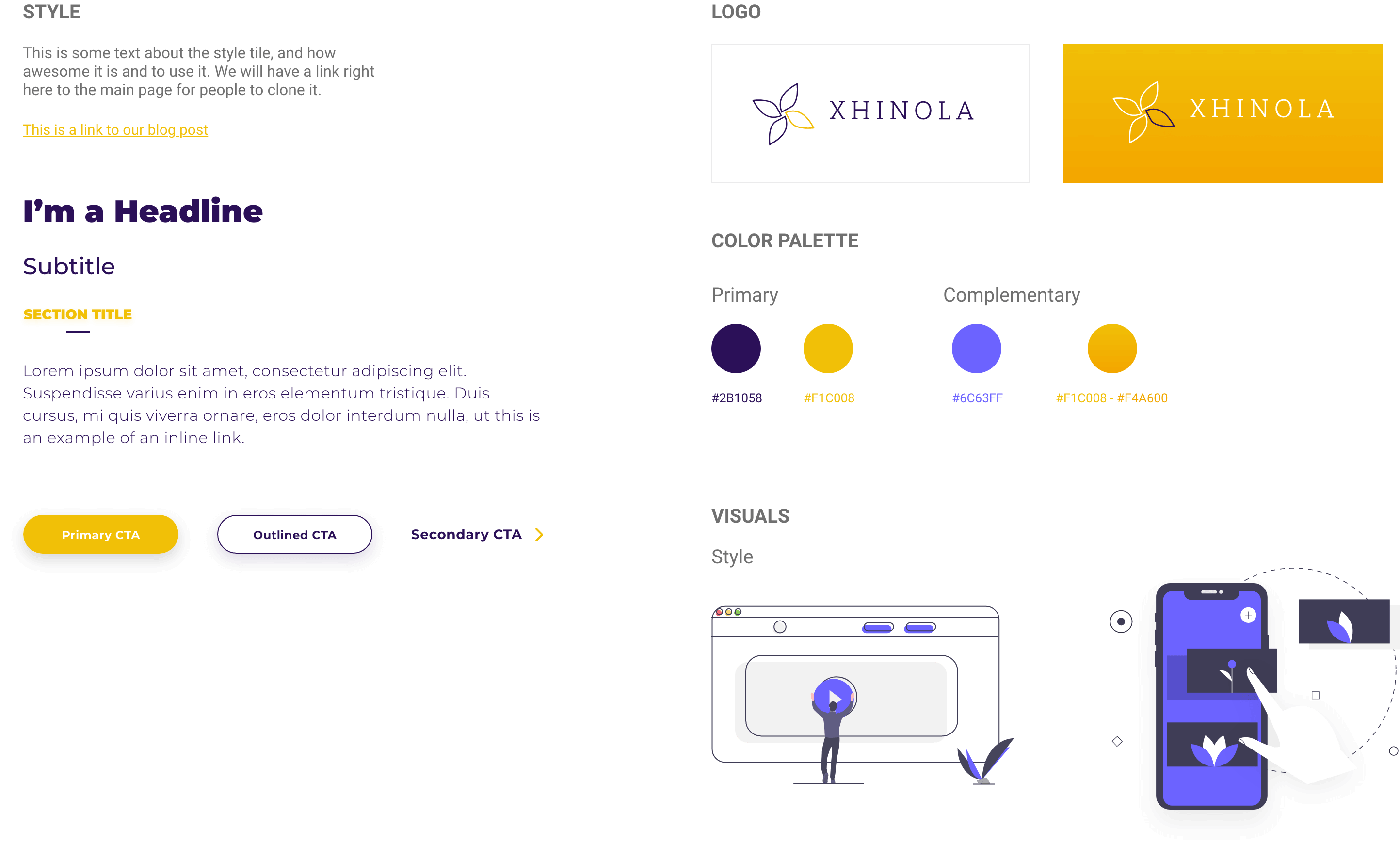
Simple & Clean
Design a clean, smooth and fresh, eye catching Landing page for Xhinola.
The landing has been created with mobile first in mind. With simple, short and clear communication, energetic visuals and color flow.
The process
User
interface

Testimonial
The structure of the page encourages continued browsing, giving visitors reasons to stay.
It was possible to communicate in a simple way all the experience and professionalism that makes up Xhinola.
Every detail was worked on, giving it the importance and relevance that it has from the point of view of a client who is looking for help and how what we communicated was in accordance with what he was looking for.


